
The Colours in Your Mind: Designing With the Senses
Spring has a way of gently switching the world back on.
After months of restraint, colour returns with confidence, filtering into gardens, wardrobes, and interiors alike. It is one of my favourite seasons for that very reason. But colour is not just something we see. It is something we feel. The question is not simply how much colour you like, but how well you respond to it.
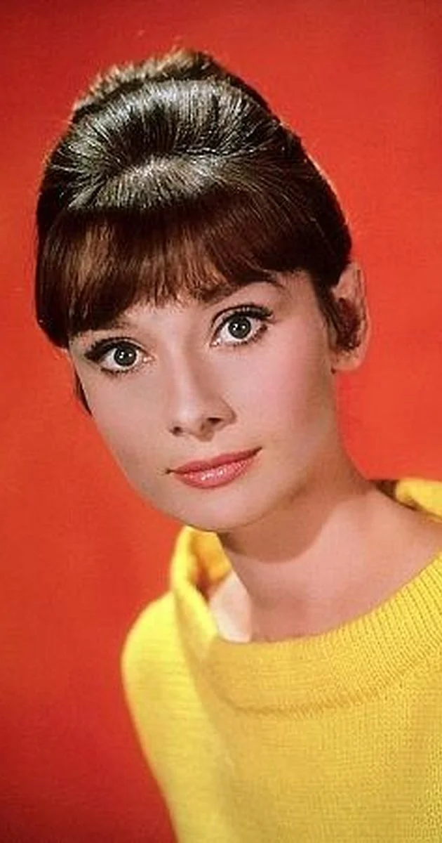
Take Audrey Hepburn, for example. She was famously impeccable in her use of colour, never visually discordant, and even extended the idea into her diet, choosing foods by colour to create balance. Intuitive perhaps, but also deeply sensory. Colour, after all, feeds us long before we consciously analyse it.
In design, colour works in much the same way. Long before we register shapes, textures, or layouts, colour sets the emotional temperature of a space. It can soothe or stimulate, ground or uplift. Pairing complementary tones, balancing strong hues with quieter ones, and understanding when to soften or intensify colour can determine whether a room feels harmonious or jarring.
A brief detour into science helps explain why. Colour originates from the light spectrum and is understood through three components: lightness, saturation, and hue. Lightness is the dance between light and dark. Saturation describes intensity, whether a colour feels vivid or muted, warm or cool. Hue is simply the colour name itself, the red, blue, or green we recognise. Together, these elements form colour theory. Useful, yes, but theory alone is not what makes colour powerful.
What truly matters is impact. Colour has been used therapeutically for centuries, with chromatherapy exploring how different colours influence physical and emotional states. While responses are always personal, there is little doubt that colour affects mood and behaviour. This is why choosing colours for the spaces we inhabit deserves thought. The “right” colour is rarely universal. It is deeply individual, shaped by memory, culture, and sensation.
For instance, despite my love of spring gardens bursting with yellow daffodils, yellow is not a colour I naturally gravitate towards. Yet it is everywhere in design right now, and when handled thoughtfully, it can be surprisingly inviting. For me, that means restraint. Muted mustard tones or soft custard shades rather than anything too sharp. In my entrance hall, painted a rich petrol blue, I introduce spring through subtle yellow accents. The contrast feels warm and deliberate, not overwhelming.
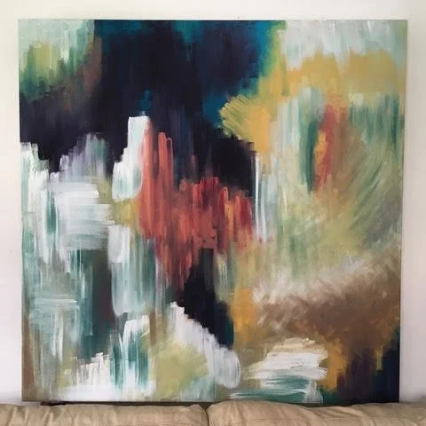
Using colour: painting by Alison Tordoff
Designing with the senses is about these small, considered choices. A cushion, a lampshade, a piece of art. Colour does not need to shout to be heard. Even subtle shifts can transform how a space feels, whether the goal is energy, calm, or quiet optimism. There is a reason, for example, that some prison cells are painted a soft pink. The colour has been shown to have a calming effect, reducing aggression and anxiety.
In commercial environments, colour is often used boldly to attract attention and reinforce branding. At home, however, the relationship is more intimate. You live with colour day after day. It becomes part of your emotional landscape. Designing with the senses means listening to how colour speaks to you, and allowing it to support how you want to feel in your space.
Colour is not just decoration. It is atmosphere, memory, and emotion, quietly shaping our experience of the world.